

The Supply Mix Report is a component of the Rodan Market Dashboard and consolidates Generation Supply, Market Demand, Interchange Transactions and Market Price graphs on one screen. The information to the right of the graphs shows further details for any selected hour. By moving the cursor over the chart and clicking on the desired hour, the data for that hour will automatically update.
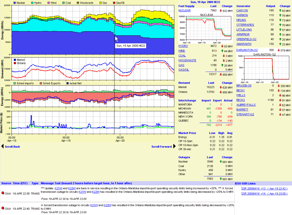
The first graph is the Generation Supply Mix, showing the total hourly average output for Nuclear, Hydro, Wind, Coal, Wood-Waste, Gas, and Gas/Oil (OPG's Lennox GS). When moving the cursor over the hour and selecting it, the information to the right will update to show the major Generator output changes that occurred for that hour. The change must be above 20MW up or down to be included in the list.
The second graph shows the 5-minute Market Demand and Ontario/Primary Demand. The Ontario Demand is defined as Market Demand minus Exports, however, its historical values are not published nor are the historical values for Exports. Instead, Ontario Demand is calculated using real-time Market Demand minus scheduled Exports. Failed, curtailed or constrained exports within the dispatch hour may not be reflected in the graph.
The third graph shows the hourly scheduled Imports (solid green) and Exports (solid red), along with the net actual historical flow (blue line) which occurred for each hour. The Interchange list to the right shows the detailed data for that hour for each Ontario Interchange. The Imports and Exports represent scheduled transactions, while the Actual values are historical and therefore may not agree entirely with the schedules. Furthermore, these values include Segregated Mode of Operations (SMO) generation which technically occur outside of the Ontario market.
The last graph shows the 5-minute Market Prices for Energy and the three types of Operating Reserve purchased in the Ontario market. To the right is the hourly average, minimum and maximum values for these markets which occurred for the hour you selected.
The last item on the right-hand-side is the Generation Outages for that hour. These outages are aggregated by fuel-type and are shown for the hour you have selected. The change from the previous hour is also shown.
The data area to the right of the charts is updated dynamically by moving the mouse over the charts and clicking on any hour of interest. The data reflects details for that selected hour, including:
When first opening the Supply Mix screen, data for the last available hour is shown.
The area below the charts is also dynamically driven by the hour you have selected on the charts. It shows the System Status Report (SSR) messages that were issued around the time of the selected hour (from 2 hours before the hour to 1 hour afterwards). Links are also provided (to the right) to the source IESO SSR files that were issued during that time so all messages can be viewed. This is critical as there may be SSR messages that apply for the selected hour that may have been issued hours or even days prior to the hour.